Custom Icons & Tooltips for Documents/Assets & Data Objects
Pimcore allows to dynamically define custom element icons & tooltips in the element tree. In addition, the icon of the editor tab can be changed.
Support for the event-based approach for Documents, Assets and Data Objects is available since release 6.4.1 If you you are looking for the (deprecated) pre 6.4.1 way (supporting Data Objects only) read these instructions.
Properties that can be changed
- Element CSS class
- Element icon
- Element icon class
- Tree node tooltip
How to override the default style
The basic idea is to provide one's own implementation of Pimcore\Model\Element\AdminStyle.
This can be achieved by attaching a listener to the AdminEvents::RESOLVE_ELEMENT_ADMIN_STYLE event.
Example:
\Pimcore::getEventDispatcher()->addListener(\Pimcore\Event\AdminEvents::RESOLVE_ELEMENT_ADMIN_STYLE,
    function(\Pimcore\Event\Admin\ElementAdminStyleEvent $event) {
        $element = $event->getElement();
        // decide which default styles you want to override
        if ($element instanceof \AppBundle\Model\Product\Car) {
            $event->setAdminStyle(new \AppBundle\Model\Product\AdminStyle\Car($element));
        }
});
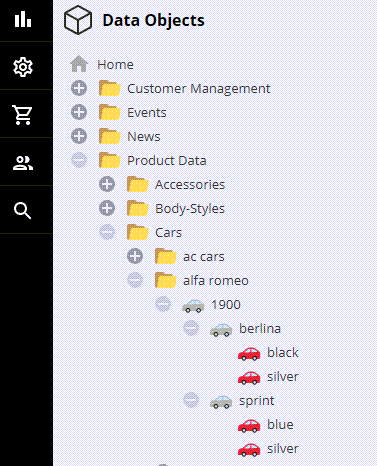
Example: Custom Icon for the Car DataObject
See demo site for comparison.
This will change the Car icon depending on the car type:
namespace AppBundle\Model\Product\AdminStyle;

use AppBundle\Website\Tool\ForceInheritance;
use Pimcore\Model\Element\AdminStyle;

class Car extends AdminStyle
{
    /** @var ElementInterface */
    protected $element;

    public function __construct($element)
    {
        parent::__construct($element);

        $this->element = $element;

        if ($element instanceof \AppBundle\Model\Product\Car) {
            ForceInheritance::run(function () use ($element) {
                if ($element->getObjectType() == 'actual-car') {
                    $this->elementIcon = '/bundles/pimcoreadmin/img/twemoji/1f697.svg';
                }
            });
        }
    }
}
Result:
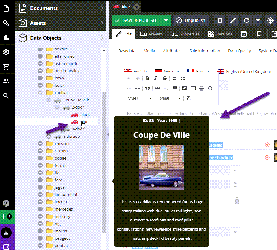
Example: Custom Tooltips
It is possible to define custom tooltips which are shown while hovering over the element tree.
The example outlines how to provide a custom tooltip for Car objects.
    /**
     * @inheritdoc
     */
    public function getElementQtipConfig()
    {
        if ($this->element instanceof \AppBundle\Model\Product\Car) {
            $element = $this->element;
            return ForceInheritance::run(function () use ($element) {
                $thumbnail = null;
                $text = '<h1>' . $element->getName() . '</h1>';

                $mainImage = $element->getMainImage();
                if ($mainImage) {
                    $thumbnail = $mainImage->getThumbnail("content");
                    $text .= '<p><img src="' . $thumbnail . '" width="150" height="150"/></p>';
                }
                $text .= wordwrap($this->element->getDescription(), 50, "<br>");
                return [
                    "title" => "ID: " . $element->getId() . " - Year: " . $element->getProductionYear(),
                    "text" => $text

                ];
            });

        }
        return parent::getElementQtipConfig();
    }
Result:
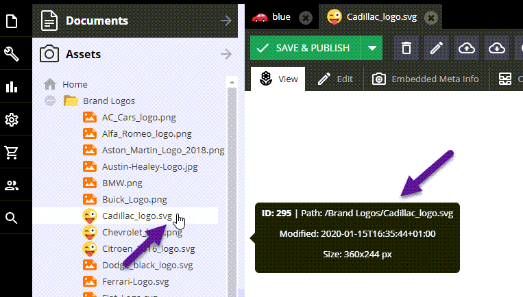
Example: Custom Style for Assets
This will display the modification date and image size as additional information. Besides that, it shows a different icon for all assets starting with a capital 'C' in their key.
namespace AppBundle\Model\Product\AdminStyle;

use Pimcore\Model\Asset;
use Pimcore\Model\Element\AdminStyle;

class AssetEventStyle extends AdminStyle
{
    public function __construct($element)
    {
        parent::__construct($element);

        if ($element instanceof Asset\Image) {
            if (strpos($element->getKey(), 'C') === 0) {
                $this->elementIconClass = null;
                $this->elementIcon = '/bundles/pimcoreadmin/img/twemoji/1f61c.svg';
                $this->elementQtipConfig = [
                    'title' => 'ID: ' . $element->getId(),
                    'text' => 'Path: ' . $element->getFullPath()
                            . '<br>Modified: ' . date('c', $element->getModificationDate())
                            . '<br>Size:  '. $element->getWidth() . 'x' . $element->getHeight() . " px" . '</p>'
                ];
            }
        }
    }
}